Display Weekends in R Using Tsibble
In the frame of the Hackaviz2020 organized by the ToulouseDataViz, I had to work on displaying weekends on a plot. And, this is not so easy for a novice …
During this Hackaviz I’ve also discovered the Tidy dataframes for Time series called tsibble and its associated universe of Tidy tools for time series, tidyverts—many thanks to my teammate for this tip. I will use them here to display weekends.
Finding Weekends
Let’s start from an example, nycflights13 containing all out-bound flights from NYC in 2013.
The first objective is to identify weekends turn the dataset into a tsibble.
library(dplyr)
library(tsibble)
library(lubridate)
library(stringr)
library(ggplot2)

flights <- nycflights13::flights %>%
  mutate(date = ymd(str_glue("{year}-{month}-{day}"))) %>%
  select(date, flight) %>%
  # Counting the number of distinct flights by date
  group_by(date) %>%
  summarise(flights = n_distinct(flight)) %>%
  # Computing the weekends by converting in weekday starting on monday to ease the cut
  mutate(weekend = wday(date, week_start = getOption("lubridate.week.start", 1)) > 5) %>%
  # Finally converting to a Tsibble
  as_tsibble(key = weekend, index = date) %>%
  arrange(date)
flights

# A tsibble: 365 x 3 [1D]
# Key:       weekend [2]
#   date       flights weekend
#   <date>       <int> <lgl>
# 1 2013-01-01     747 FALSE
# 2 2013-01-02     837 FALSE
# 3 2013-01-03     820 FALSE
# 4 2013-01-04     817 FALSE
# 5 2013-01-05     653 TRUE
# 6 2013-01-06     747 TRUE
# 7 2013-01-07     841 FALSE
# 8 2013-01-08     807 FALSE
# 9 2013-01-09     802 FALSE
#10 2013-01-10     833 FALSE
# … with 355 more rows
Plotting Weekends
To plot the weekends I did not want to use geom_rect like it is advised in some answers in SO since to use it it is required to define xmin and xmax what is tedious and require to build a specific non-tidy dataframe. Here is an approach using geom_tile.
To do it I’m filling the tile according if it’s a weekend or not so by using the variable weekend already computed (x = date, fill = weekend)
Then, some cosmetic adjustments on the y position of the tiles.
y = min(flights): to set the base of the tile not at zeroheight = Inf: to make them spread to the top of the chart.
flights %>%
    # I'm filtering the data to make it more readable in the plot
    filter(date > ymd("2013-09-30")) %>%
    # Standard plot, the flights by day as a line
    ggplot(aes(x = date, y = flights)) +
    geom_line(color = "Purple", size = 1.5, alpha = .7) +
    # Defining a special scale to fill weekends in grey
    scale_fill_manual(values = c("alpha", "grey")) +
    # And here is the trick!
    geom_tile(aes(
        x = date,
        y = min(flights),
        height = Inf,
        fill = weekend
    ), alpha = .4) +
    theme_minimal()
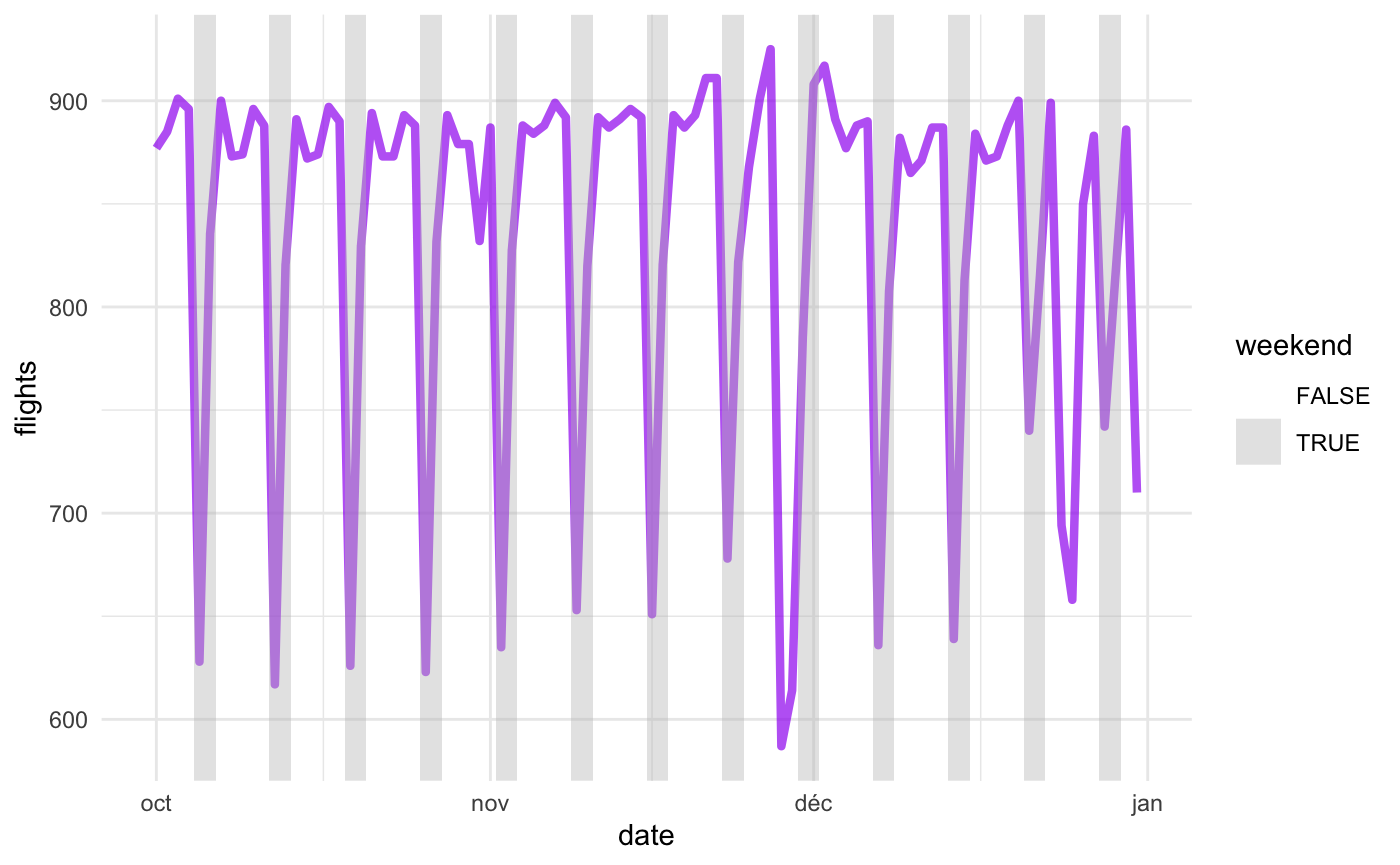
Weekends pyjama
Conclusion
According to this plot, it seems that there is less flights leaving the NYC airport in 2013. Let’s check it with the help of the tsibble. I want to check for each quarter if the average number of flights by day is lower during the weekends.
flights %>%
  # Grouping by the key that is the weekend
  group_by_key() %>%
  # Summarising data by quarter of the year
  index_by(quarter = ~ yearquarter(.)) %>%
  summarise(
    flights = mean(flights, na.rm = TRUE)
  ) %>%
  arrange(quarter, weekend)

# A tsibble: 8 x 3 [1Q]
# Key:       weekend [2]
#   weekend quarter flights
#   <lgl>     <qtr>   <dbl>
# 1 FALSE   2013 Q1    844.
# 2 TRUE    2013 Q1    719.
# 3 FALSE   2013 Q2    877.
# 4 TRUE    2013 Q2    749.
# 5 FALSE   2013 Q3    887.
# 6 TRUE    2013 Q3    756.
# 7 FALSE   2013 Q4    869.
# 8 TRUE    2013 Q4    747.
And yes it’s true the number of flights leaving the NYC airport in 2013 is lower during the weekend (< 800) than during the week (> 800).