Too many categories
By using the same fun analysis as in my previous article, I would like too highlight a problem that often occurs, dealing with too much categories (or factors as they are called in R) avoid to see clearly the big pictures.
The problem
To stick to my previous example, I want this time to check the Body Mass Index (BMI) by species. But in the starwars dataset there is a bunch of species, and it’s not easy to visualize the result – I have removed Jabba the Hutt since he crushes all the other categories that cannot be viewed at all, see my previous article for the full story.
starwars %>%
    mutate(height = set_units(height, cm)) %>%
    mutate(mass = set_units(mass, kg)) %>%
    mutate(bmi = mass / set_units(height, m) ^ 2) %>%
    select(name, height, mass, bmi, species) %>%
    drop_na() %>%
    filter(mass != max(mass)) %>% # Here is Jabba!
    ggplot() +
    geom_boxplot(aes(bmi, species, colour = species, fill = after_scale(alpha(colour, 0.5)))) +
    theme_minimal()
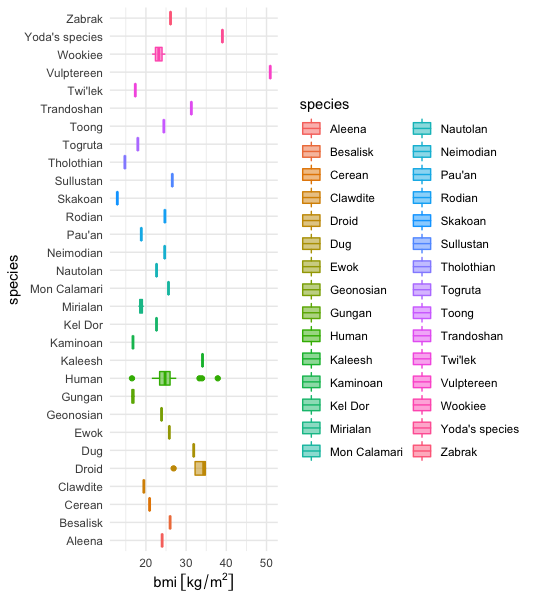
Too much categories
The solution
The solution is to lump together the less representative categories (in this case the species) in a big category often called Other. R , in the package forcats, provides a very convenient functions to perform this operation in different flavors fct_lump. I will use the fct_lump_n that
lumps all levels except for the
nmost frequent (or least frequent ifn < 0)
So this means if I use mutate(species = forcats::fct_lump_n(species, n = 5)) I will end with the five most frequent species (species having the most individuals) plus the other species lumped together in the Other category.
Let’s check the result.
starwars %>%
    mutate(height = set_units(height, cm)) %>%
    mutate(mass = set_units(mass, kg)) %>%
    mutate(bmi = mass / set_units(height, m) ^ 2) %>%
    select(name, height, mass, bmi, species) %>%
    drop_na() %>%
    filter(mass != max(mass)) %>% # Here is Jabba!
    # Here is the trick lumps all levels to "other" except for the n most frequent
    mutate(species = forcats::fct_lump_n(species, n = 5)) %>%
    ggplot() +
    geom_boxplot(aes(bmi, species, colour = species, fill = after_scale(alpha(colour, 0.5)))) +
    theme_minimal()
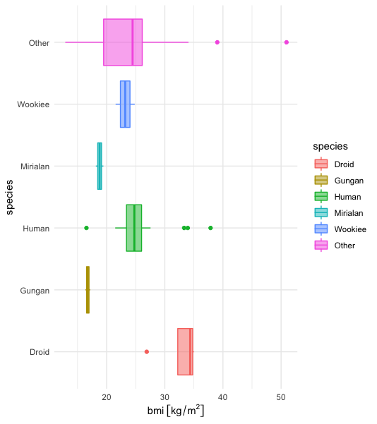
Top 5 !
So it makes sense
- the human specie fall in the standard BMI range for humans,
- droids are heavier, it seems logical since they are made of metal as I far as I know.